Table of Contents
Optimizing Store Layouts with Customer Foot Traffic Patterns: Key Strategies for Permanent and Pop-Up Retail Spaces
Introduction
Retail thrives at the intersection of art and science. Understanding how customers navigate and engage with store environments is critical for designing layouts that not only encourage exploration but also drive conversions. This comprehensive article explores foot traffic patterns, effective store layouts, product placement tactics, and additional selling strategies tailored to both permanent and pop-up retail spaces.
Understanding the Psychology Behind Customer Foot Traffic Patterns
Retail success begins with understanding the psychology of movement. Customers' navigation through a store is influenced by a variety of factors, including cultural norms, personal preferences, and environmental design.
for example:
1. The Matter of Entry
Whether you have a large space to define a foot pattern, or you are a single table, you will always have a sales floor space area. The space between your store and your neighbors is the walkway, pathway, or hallway, and it doesn't belong to either of you. It is meant for the customer, as well as for safety for everyone involved in an emergency evacuation. Don't crowd hallways. It may help to get clarification of property lines at the start of the set up from the event organizer to resolve any disputes.
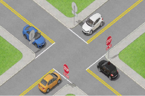
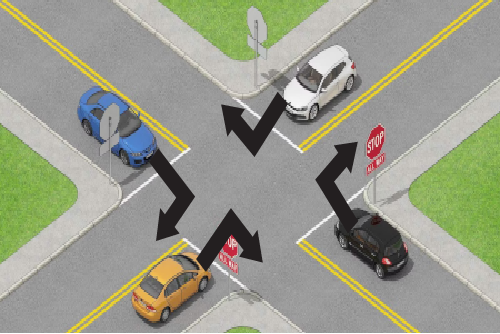
After learning your designated sales space, the next important quesetion is to determine the best entrance for your pop-up store. It goes without saying that customers will need to have an entry point to acccess your store, and it should compliment your preferred floor pattern layout. The key point here that is vital for success, is as simple as knowing the natural flow of traffic. Just as 90% of the world does, in American Culture, when we are moving forward, we are on the right-hand side of the road. What does this mean for you? That the foot traffic in your store, just like driving, is going to favor the right side - of everything - as they move in a counter-clockwise motion throughout the store, switching between looking ahead, and then towards the wall that is to their right.
How do you tie the entrance in with the floor pattern? The entrance. Knowing that the right side is favored due to a deeply imbedded system we learn since childhood, it therefore makes sense to favor having the entrance on the right hand side of your store. As in the examples that will be provided, no one is limited to this, and you ultimately have the final say on what goes where, but working smarter yields better results than working harder. This entryway can either be a door, open space between store fixtures, or a guided entrance. Most pop-up shops won't have a doorway, so having a clearly defined store boundary will help determine this open entrance style.
This is a map of the world I got from Wikipedia. The red represents the countries that drive on the right side of the road for anyone who is curious.
Here is a lovely little example to demonstrate and really drive my point (no pun intended):
Kinda makes you cringe a little, doesn't it? Well, luckily there is a simple fix that will ease that life-long, deeply and firmly implanted root:
2. Visual appeal:
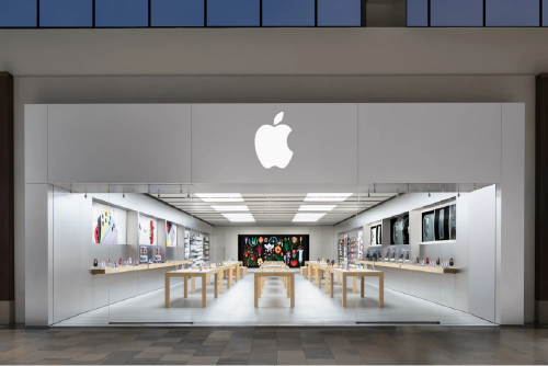
Shoppers are drawn to displays that stand out due to strategic lighting, bold colors, or innovative designs. In this example, apple is using an open entry - there isn't a clearly defined entrance, nor exit. Will that stop you from entering on the...which side?
3. Congestion Aversion:
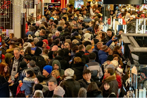
Customers avoid crowded areas, highlighting the importance of well-designed pathways. Would you go into this area? Cool, neither would I. Traffic jams are real life nightmares and make real life much scarier than any Hollywood movie. Congestion is ineffective and inefficient. It means that customers aren't getting to you, and when they finally do, they arrive frustrated and less likely to spend their hard earned cash. If you begin to notice congestion, communicate. Work with your neighbors, talk to the promoter, or jump in and start directing traffic yourself (if you are confident you can alleviate the problem). Figure out the source of the problem, neutralize it, and learn preventative measures for the future.
4. Perception of value:
The positioning of products such as clearance or premium items affects customers' buying decisions. More on this in a moment.
Acknowledging these tendencies allows retailers to create layouts that enhance shopping experiences and maximize sales opportunities.
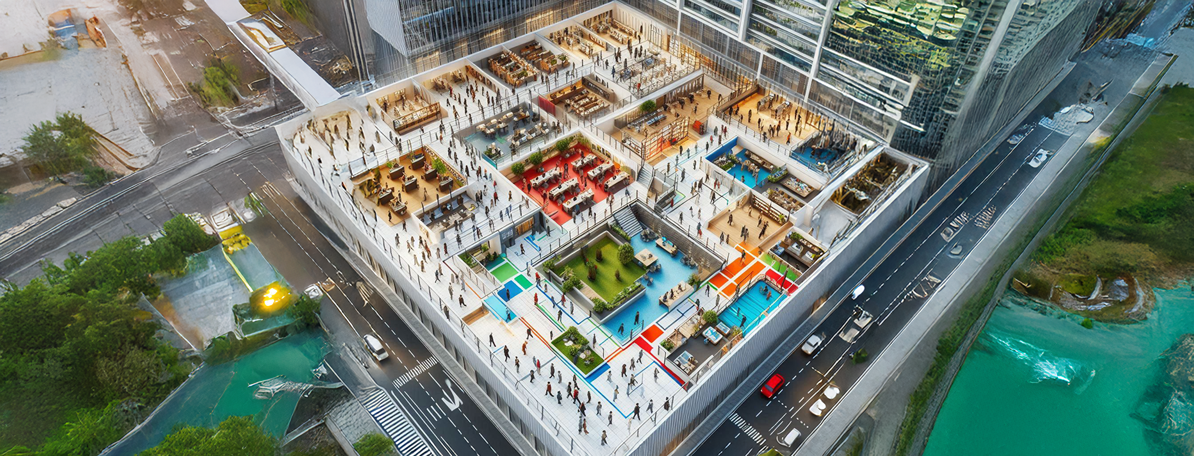
Common Retail Layout Strategies
Retailers employ various store layouts to guide customers effectively. Here is a handful of common floor pattern layout ideas, and how to impliment them.
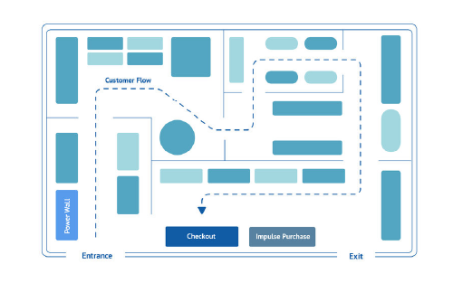
Please note: the red dots are intended starting points for your store, and the blue dots are the finishing points. Observe the directional flow and how they relate and determine product zoning.
Important note! Stores should have a decompression zone at their entrance - this zone is shown with a dashed border at the entrance. You know how sometimes you walk into a room and totally forget the reason you came in there? This is because walking through doorways/entrances does something funky to our hardwiring. It causes a glitch in the software. This is a good thing for store owners. In these initial few seconds of walking into your store, as our systems are rebooting, you want to offer a space to let the customer decompress from what was on the other side of that door, as well as give an inviting, welcoming, and inticing draw in that nobody can refuse. You also don't want to overwhelm shoppers in their reboot. First impressions are made in the subconscious within the first 7 seconds. Make it count, and I'll show you how to do it in your favor.
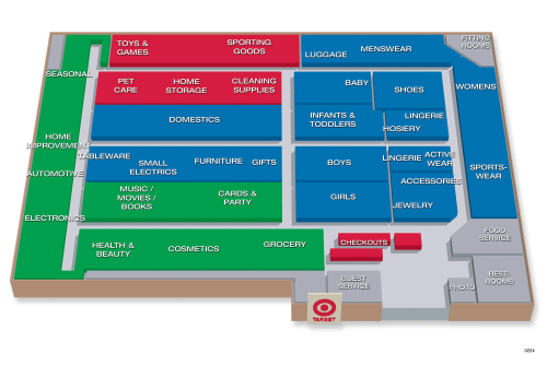
1. Grid Layout:
Best for high-volume, wide-product-range stores, such as supermarkets, or pop-ups with a large inventory and variety of products.


Creates an organized shopping experience, even for pop-ups that have categories that overlap and blend together.

Typically will have two entrances/exits - one on either end of the same side of the store, forming a "U" or staple shape.
Example: Safeway
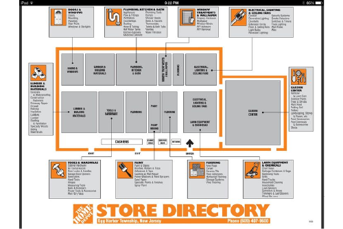
Example: Home Depot
2. Racetrack/Loop Layout:
Ensures customers interact with all sections of the store.

Suitable for big box stores, themed layouts, or pop-ups with clearly designated and well defined categories of products, where each section offers something shoppers something specific and different.

Example: Home Depot
Typically will have the entrance and exit be located together in one location, as to complete the "loop".


Example: Target


3. Free-Flow/Boutique Layout:

Ideal for pop-ups with boutique, hand-crafted, or homemade environments.
Promotes exploration and aligns with relaxed themes with slower-paced experiences.
Can have one, multiple, or no clearly defined entrances/exits, which can be located anywhere around the store.
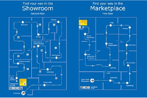
Forced-Path Layout:
Builds a unique and immersive environment, often as a guided tour or has a consecutive order.
Best for storytelling-focused pop-up spaces, where the customer experiences a sequence of real life scenarios.
Also works well for pop-ups that offer a rich history or bold background, where detailed product information enhances the overall branding.
Will always have a designated entrance and exit, a starting line and a finishing line, or beginning and an ending.
Example: Ikea
Strategic Product Placement for Optimal Sales
Product placement is just as critical as store layout. Proper positioning leverages customers' visual and physical interaction tendencies to boost sales.
-
Eye-Level is Buy-Level: Products at eye level attract the most attention.
- This zone is ideal for high-margin (most profitable) items, or products you're eager to promote.
- For adults, this is approximately 4-5 feet off the ground.
- For children's items, adjust to their eye level.
- The "Grab-and-Go" Zone: Lower shelves (below eye level) are great for essential or frequently purchased items, as customers often bend down for practical items like canned goods or toiletries.
- Top Shelves: Ideal for premium, less frequently bought products.
- The elevated position signals exclusivity.
- Checkout Counter Displays:
- Placing small, low-cost items such as snacks, accessories, or novelty goods near checkout taps into impulse buying behavior.
- Be sure to be strategic with these items, and don't overcrowd or overwhelm the already stressful checkout process.
- End-Caps and Focal Displays: These high-visibility spots, found at the end of aisles, are ideal for promotional or seasonal items.
- Think products that you don't always carry, have in stock, or items that have a high turn-over rate.
- Take advantage of any and all available space afforded to you.
Other Effective Selling Strategies
In addition to optimizing layouts and product placement, consider these techniques to enhance customer engagement and drive sales:
- Visual Merchandising: Use consistent branding, attractive displays, and creative signage to make products irresistible. Pop-ups especially benefit from "Instagrammable" setups that attract social media attention.
- Create Hotspots: Position popular items or promotions in multiple locations to increase visibility and entice customers to browse other products nearby.
- Cross-Selling Zones: Place complementary products together to inspire purchase combinations. For instance, a pop-up selling artisanal food could position cheese alongside wine.
- Limited-Time Offers: Use time-limited promotions or exclusive items to create urgency. Customers are more likely to act when they fear missing out.
- Interactive Experiences: Incorporate touchscreens, AR/VR experiences, or live demonstrations to engage customers actively. Pop-up stores especially thrive on such experiential elements.
- Guided Customer Flow: Subtly guide customers toward key zones through pathways, lighting, and strategic product placement.
How Venders Can Apply These Strategies to Their Pop-Up Stores
Pop-up shops, with their temporary nature, demand maximum efficiency and creativity. By integrating product placement strategies and layout insights, retailers can craft unforgettable customer journeys:
- Emphasize Star Products: Place must-see products at eye level near the entrance to draw customers in.
- Create a Flow: Use open layouts that encourage natural exploration without feeling crowded.
- Tell a Story: Align the arrangement and design with the brand's narrative to captivate customers emotionally.
- Adapt and Optimize: Use real-time feedback (like observing customer behavior) to adjust placements and layouts on the fly.
- Focus on Mobility: Design layouts that are easy to dismantle and reconfigure for quick setup in different venues.
Adapting Pop-Up Stores to Different Audiences and Locations
Pop-up shops are unique in their ability to adapt quickly and deliver highly localized experiences. Retailers should focus on:
Cultural Relevance:
Tailor layouts and product offerings to the community or demographic they’re targeting. For instance, a pop-up in a bustling urban setting might feature compact, high-density displays, while a suburban location might benefit from spacious layouts emphasizing leisure.
Flexible Design:
Use modular fixtures and adaptable spaces that can be rearranged to fit diverse venues and customer preferences.
Local Partnerships:
Collaborate with local artists or businesses to create a sense of community and authenticity. This can significantly impact customer loyalty and engagement.
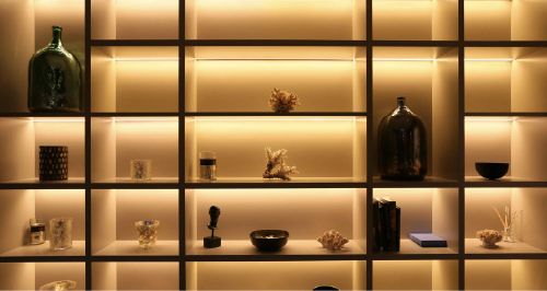
Sensory Marketing: Guiding Movement Through Senses
Retail design extends beyond visuals; tapping into all senses can profoundly influence customer behavior. Consider these sensory marketing strategies:
Scents: Subtle fragrances like lavender or citrus can evoke calmness and comfort, encouraging shoppers to linger.
Sounds: Carefully selected music sets the tone. Upbeat tracks can energize shoppers, while slower rhythms promote leisurely exploration.
Location, location, lo-Lighting: Accent and key light fixtures can highlight specific products, create focal points, and elevate the visual appeal of your presentation.
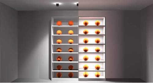
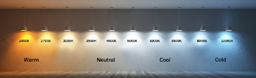
- Warm, low-temperature (2700-3000k) offers relaxed, comfortable, inviting lighting, that draws people into your space.
- Cool, high-temperature (4000-5000k) offers more dynamic, alert, and active enviornments where excitement is wanted.
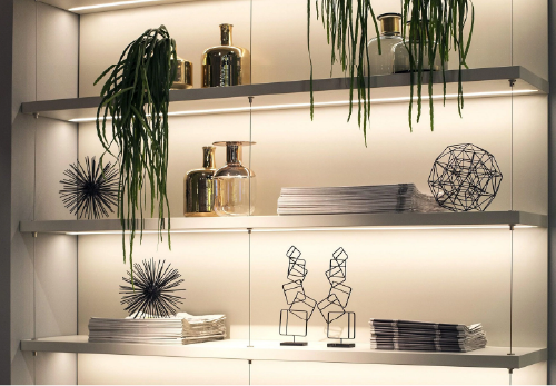
Tactile Elements: Interactive features like touchable product displays or textured decor invite deeper engagement. When shoppers are able to make a physical connection with your product, it increases the chances of them becoming a buyer.
Time is Money: Whichever your store chooses to compliment its products, creating a unique, enjoyable, and memorable experience can and will set you apart as strong vender. By building these catered enviornments, customers are more likely to spend more time browsing, which increases the buying potential. You want your customers to spend as much as their available time in your store, while also respecting their own decision making process. Your goal is to build the best case scenario where your store enviornment is tailored specifically to your particular niche and customer base. Focus your energy and be creative, and remember: you want your customers to want to be in your store. What can you do to make that happen?
P.S. I've never once heard a customer say, "I'm so upset right now. I had too much fun in every store with every vendor." Let your unique store experience speak for itself. The vender next to you is your neighbor, they are your friend. The better you are able to work together to ehance the customer experience, the more fun and enjoyment can be had. Ultimately, the best chance that you have at succeeding, is ensuring that everyone succeeds. The better that everyone else does, the better you do. When I win, you win. The better we do, the better I do. We are all in this together. Never forget that.
Technology Integration in Layout Design
Emerging technologies are reshaping how retailers conceptualize and execute store layouts. Pop-ups, in particular, can benefit greatly from these tools:
AI-Assisted Layout Design:
AI can analyze data from past customer interactions to optimize product placement and foot traffic flow. For instance, algorithms can recommend the ideal placement for high-demand items based on historical sales patterns.
Predictive Analytics:
By leveraging data from customer surveys, social media, or previous pop-ups, retailers can forecast which products or layouts will resonate most with their target audience.
Augmented Reality (AR):
AR applications allow customers to visualize products in different contexts, adding an interactive dimension to pop-up shops.
Example: A tech-focused pop-up could use AI to design a layout that maximizes engagement with its newest gadgets, while offering an AR experience to showcase product functionality.
Impulse Buying: The Psychology and Placement Strategies
Impulse purchases contribute significantly to retail sales. Understanding their psychology can help in designing layouts that capitalize on this behavior:
Emotional Triggers: Products that evoke a sense of fun, nostalgia, or urgency are more likely to inspire impulse buys.
Strategic Placement: Place small, eye-catching items near checkout counters or along major traffic zones to catch attention. Pairing related items (e.g., gourmet sauces next to artisanal chips) can further boost sales.
Limited-Time Exclusives: Pop-ups are uniquely positioned to create urgency. Limited-edition products or flash sales encourage quick decision-making.
Optimizing Pop-Up Layouts Through Feedback
Continuous improvement is key, even for short-term setups. Effective feedback mechanisms for pop-ups include:
Heat Mapping: Track which areas of the store receive the most foot traffic to identify popular zones.
Customer Surveys: Quick polls or interactive feedback stations can provide insights into customer preferences and pain points.
Observation and Iteration: Simply observing customer behavior in real-time can reveal layout inefficiencies or overlooked opportunities.
By analyzing these insights, retailers can adjust layouts on the fly or apply lessons learned to future pop-up endeavors.
Conclusion:
Elevating the Temporary to the Extraordinary
Pop-up stores offer an incredible opportunity to experiment, innovate, and connect with customers in ways that permanent setups might not. By incorporating advanced sensory strategies, leveraging emerging technologies, and continually optimizing based on feedback, retailers can transform these temporary spaces into powerful brand experiences.
Every element, from lighting to product placement, tells a story. For pop-ups, the narrative isn’t just about products—it’s about leaving a lasting impression. When done right, even a fleeting encounter can lead to lasting customer loyalty.
Design with Purpose
From mega-marts to micro pop-ups, the art of store design is about creating a meaningful, memorable customer experience. By understanding foot traffic patterns, refining product placements, and embracing innovative selling strategies, retailers can turn any space into a thriving sales environment.
With pop-up stores, the stakes are even higher—but so are the opportunities. Strategic design can transform temporary spaces into powerful brand platforms, leaving lasting impressions on customers and delivering tangible results.